You should spend about 20 minutes on this task.
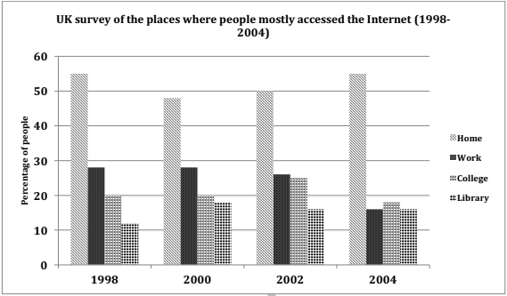
The graph below shows the changes in the places where people used to surf the Internet in the years 1998, 2000, 2002 and 2004. Summarize the information by selecting and reporting the main features and make comparisons where relevant.
Write at least 150 words.

Model Answer
The given column graph compares the changes in the places where people accessed the Internet between 1998 and 2004. It is clear that the maximum people surfed the Internet from home in all the given years.
It can be seen from the graph that more people surfed the Internet at home and in their working places than in the colleges and libraries. The percentage of people who accessed the Internet from home fell from approximately 55 in 1998 to 48 in 2000. After that this percentage began to rise steadily and reached 55 in 2004. The second most common place where people accessed the net was office. The proportion of people who spent their online time at work was between 25% and 30% from 1998 to 2002, but fell to 15% in 2004. Approximately 18%-25% people used the Internet at college in all the given years. The least percentage surfed the net in libraries. This percentage fluctuated between 12% and 18% over the given years.
Overall, the discrepancy between people surfing the net from home and all other places was high in all the four given years.