You should spend about 20 minutes on this task.
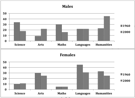
The charts below show the percentages of male and female students getting top grades in 1960 and 2000. Summarise the information by selecting and reporting the main features and make comparisons where relevant.
Write at least 150 words.

Model Answer
The given column graphs compare the proportion of boys and girls getting top grades in five subjects, which are science, arts, maths, languages and humanities, in 1960 and 2000. It is clear from the graph that girls scored higher in Arts and languages, whereas boys scored higher in science and math in the given years.
In 1960, slightly over 30% boys scored good grades in science and maths, whereas in languages and humanities the high scorers were 20% each. Only one in ten scored high in Arts. In contrast, girls did much better in languages, Arts and humanities, with 45%, 32% and 30% scoring high in these subjects respectively. Only 10% girls scored high in science and the least (5 %) scored high in maths.
In 2000, among boys, the percentage of top scorers in arts and humanities almost doubled where as that in science and math became approximately half as compared to the figures of 1960. The percentage of top scorers in languages remained the same. Among girls, however, the percentage of top scorers in arts, languages and humanities decreased moderately, whereas that in science and maths remained the same.
Overall, it is surprising to see that boys scored better than girls in humanities in the year 2000.