You should spend about 20 minutes on this task.
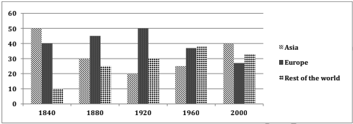
The diagram below shows the percentage of share of total world production of wheat by Asia, Europe and other part of the world from the years 1840 to 2000. Summarise the information by selecting and reporting the main features and make comparisons where relevant.
Write at least 150 words.

Model Answer
The given column graph gives information about the share of total world production of wheat in Asia, Europe and the rest of the world, from 1840 to 2000. In general, no specific trend can be seen in all the three regions.
In 1840, Asia had the highest share of wheat production (50%), whereas Europe produced 40% and the rest of the world only produced 10%. The production of wheat in Asia fell significantly and reached an all time low of 20% by 1920, after which it picked up again and became 40% by 2000. Europe’s share of wheat production increased steadily till 1920 and reached 50%, after which it dropped and bottomed at approximately 27% by 2000. Wheat produce from the rest of the world escalated moderately till 1960 and reached 38% but after that showed a slight fall and became 33%.
Overall, it can be seen that by 2000, the difference in all the three regions in terms of wheat production was not much pronounced, but Asia was the undisputed leader.