You should spend about 20 minutes on this task.
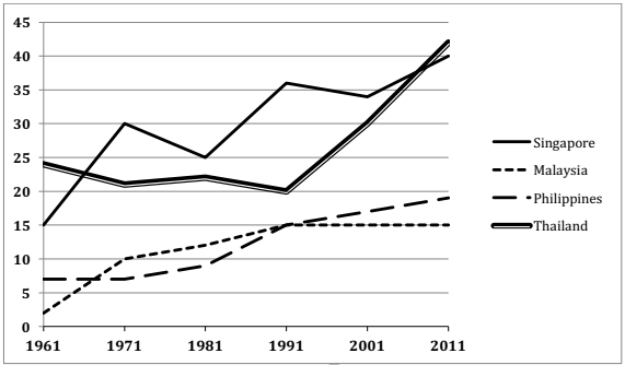
The graph below shows the percentage of 18-25 year olds in universities in four different countries. Summarise the information by selecting and reporting the main features and make comparisons where relevant.
Write at least 150 words.

Model Answer
The given line graph illustrates the proportion of university students in four countries, namely Singapore, Malaysia, Philippines and Thailand, between 1961 and 2011. From a cursory glance it is manifest that more students went to universities from Singapore and Thailand than from Malaysia and Philippines.
A small minority (2%) of Malaysian students between the ages of 18 and 25 went to universities in 1961. This percentage increased significantly and reached 10% by 1971. Then there was a steady increase and by 1991, 15% students went for tertiary education, after which their number stabilized and remained at that level till 2011. Approximately 7% Filipinos of this age group attended universities in 1961. Their percentage also increased over the given period and reached a little under 20% by 2011.
Singaporean students going for tertiary education were 15% in 1961. Their percentage increased markedly and reached 40% by 2011. There were fluctuations in between, but overall the trend was upward. The Thai students studying in universities decreased from 24% to 20% from 1961 to 1991, but after that there was a dramatic increase and their percentage almost doubled in the next two decades.
Overall, there was an upward trend in the 18-25 year old tertiary education seekers, in the given four countries.