You should spend about 20 minutes on this task.
The charts below give information about the amount and types of water in the world, and also tell the use of water in three areas in three countries. Summarise the information by selecting and reporting the main features and make comparisons where relevant.
Write at least 150 words.

Model Answer
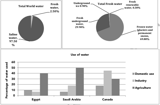
The given pie charts depict the quantity and sorts of water in the world and the column graph portrays the proportion of fresh water used for three different purposes in Egypt, Saudi Arabia and Canada.
From the first pie chart it is obvious that a major chunk (97.50%) of the global water is saline water and the remaining (2.5%) is fresh water. The second pie chart shows that a little over two third (69.80%) is frozen water in the form of glaciers and permanent snows, whereas a little under one third (29.90%) is fresh underground water. 0.90% of fresh water is in the form of underground ice, whereas a very small fraction, which constitutes 0.30%, is fresh renewable water.
From the column graph it is clear that in Egypt, 40% water is used for agriculture, which is the highest use, where as only 10% and 8% water is used for domestic purposes and industry respectively. The Saudis also used the maximum (50%) water for agriculture. They used 18% water for industry, which was more than two times of that used by the Egyptians for this purpose. The Saudi Arabians used only 8% for domestic use. It is interesting to note that the Canadians used the maximum (47%) water for industry. They used 30% for agriculture and around 18% in their households
Overall, it is clear that fresh water is a very precious commodity as only 2.5% of the total water on this planet is fresh, and out of that a very small fraction is usable water, which is used for domestic, industrial and agricultural use.