You should spend about 20 minutes on this task.
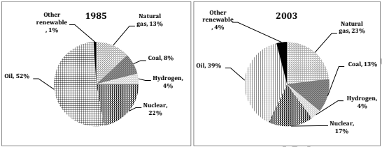
The charts below show the proportion of the energy produced from different sources in a country between 1985 and 2003. Summarize the information by selecting and reporting the main features, and make comparisons where relevant.
Write at least 150 words.

Model Answer
The given pie charts compare the percentage of energy generated from various sources in a particular country from 1985 to 2003. It can be seen that the use of some sources to produce energy increased with time, whereas that of others decreased.
Oil was the major source of energy production throughout the whole period, although its usage dropped from just over a half (52%) in 1985 to approximately two fifth (39%) in 2003. The use of nuclear also declined from 22% to 17% over the given period.
The use of natural gas and coal showed an increase from 13% and 8% in 1985 to 23% and 13% respectively in 2003. Interestingly, the proportion of energy produced from hydrogen remained stable at 4%, whereas that from other renewable sources increased from 1% to 4% over the given period of 18 years.
Overall, the maximum energy was produced from oil and the least from hydrogen and other renewable sources from 1985 to 2003.