You should spend about 20 minutes on this task.
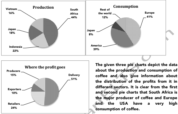
The three pie charts below show the coffee production and consumption of coffee and where the profit goes around the world. Summarise the information by selecting and reporting the main features and make comparisons where relevant.
Write at least 150 words.

Model Answer
From the first chart it is clear that South Africa produces the maximum coffee. Its coffee production is 44% and Indonesia’s production is half of that. Japan and Vietnam stand at 18% and 16% of coffee production, respectively.
The second pie chart reveals that the maximum consumption of coffee is in European nations (41%) and the second highest consumption is in the USA (39%). Japan needs to import only 8% of the coffee, as it is also a coffee producer. The rest of the world consumes just over a fifth of the coffee.
The profit distribution in the coffee market is illustrated in the third pie chart. Half of the total profit is earned by the delivery sector, whereas the retailers earn almost a quarter of the profits. A tenth of the profits go the exporters and the remaining 15% profits are earned by the production sector.
Overall, it can be said that the countries that consume the most coffee are also the biggest importers of coffee. It is also surprising that the delivery sector earns more profit than any other sector.