You should spend about 20 minutes on this task.
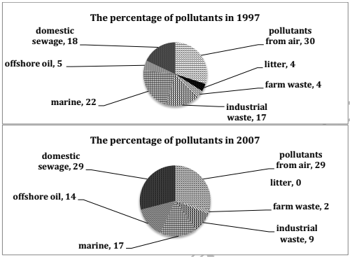
The two pie charts show the percentage of pollutants entering a particular part of ocean in 1997 and 2007. Summarize the information by selecting and reporting the main features, and make comparisons where relevant.
Write at least 150 words.

Model Answer
The two pie charts give information about the percentage of pollutants that entered a specific section of ocean in 1997 and 2007.
The quantity of domestic sewage entering the ocean increased significantly, from 18 percent to 29 percent, during the ten-year period. The pollutants from air were approximately the same at about 30 percent in both the given years. 14 per cent of pollution was from offshore oil in 2007, which was about three times the figure, a decade ago.
By contrast, industrial waste and marine saw a fall of 8 percent and 5 percent during this period. The pollution from litter accounted for 4 percent in 1997. However, it is interesting to note that there was no litter in this part of ocean in 2007. The amount of pollutants from farm waste declined from 4% to 2% in ten years time.
Overall, the pollution from domestic sewage and offshore oil increased, while there was a drop in the amount of other pollution.