You should spend about 20 minutes on this task.
The graphs below give information about computer ownership as a percentage of the population between 2002 and 2010, and by level of education for the years 2002 and 2010.
Summarise the information by selecting and reporting the main features, and make comparisons where relevant.
Write at least 150 words.


Model Answer
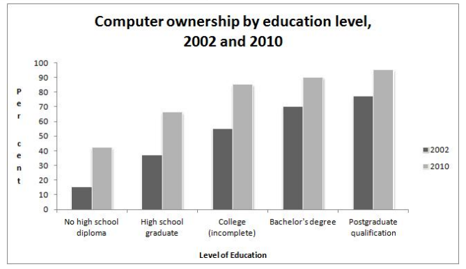
The bar graphs provide data of computer ownership as percentage of population from 2002 to 2010 and by various level of education in the years 2002 and 2010.
Overall, there were an increasingly onward of computer owners from 2002 to 2010, while 5 different level of students ,their computer using rates altered significantly and increasingly in 2002 and 2010.
According to the first graph, it illustrates that in 2002 there were approximately 56% of people who owned computer and it rose gradually from around 56% in 2002 to well-over 60% in 2008.Furthermore , it increased very slowly and reached its peak in 2010 from well-over 60% to considerably 74%.
Base on the following figure , in 2002 it indicates that there were about 13% of computer users who had no high school diploma and this was triply less than students who had completely graduated from high school whose proportion was hovering 30% of computer users. Meanwhile,in 2002, the proportion of postgraduate qualifiers was the maximum, which was approximately 75%;followed by Bachelor’s degree qualifiers and incomplete college students: around 70% and slightly under 60%,respectively.However, it is suggested that the in 2010 these groups maintained very similar around 85% to 95% of users as the postgraduate qualifiers still were the most users like they were in 2002.