You should spend about 20 minutes on this task.
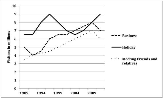
The graph below shows the number of overseas visitors who came to the UK for different purposes between 1989 and 2009. Summarize the information by selecting and reporting the main features, and make comparisons where relevant.
Write at least 150 words.

The given line graph illustrates the number of foreign visitors who came to the United Kingdom for business, holiday and for meeting kith and kin, from 1989 to 2009. It can be seen that tourists who came for holiday were more than those for the other given purposes for a major part of the given two decades.
About 6.5 million people travelled to the UK for holidays in 1989. This number rose rapidly and peaked at 9 million by 1997, but after that fell dramatically and reached 6.5 million in 2004. After that the number of visitors picked up again and again reached a high of 9 million in 2009.
Meanwhile, business and socializing trips to the UK showed almost similar trends, starting from 3.5 million and 5 million respectively in 1989 and then rising moderately to reach 6 – 7 million in 2009. After that a fall in the number of visitors can be seen in both these cases. Throughout the given period, more people did business than those who visited their family and friends.
Overall, an upward trend can be seen in all the three reasons for visiting abroad.