You should spend about 20 minutes on this task.
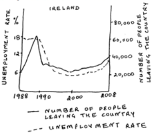
The graph below shows the unemployment rate in Ireland and the number of people leaving the country between 1988 and 2008. Summarize the information by selecting and reporting the main features and make comparisons where relevant.
Write at least 150 words.

Model Answer
The given line graph compares the relation with the unemployment rate and the number of people emigrating or migrating from Ireland between 1988 and 2008. It is manifest from the graph that from 1990 to 2008, unemployment rate and number of people leaving Ireland showed similar trends.
From 1988 to 1990, there was a dramatic escalation in the number of people leaving Ireland. It increased from 20,000 in 1988 to nearly 60,000 in 1990. After 1990, there was a sharp decline in the number of Irish people moving out from their home country, to nearly 30,000. This was followed by a slow drop in numbers, with minor fluctuations, to 20,000 by the year 2000. After 2000, there was again a moderate rise in the number of people quitting Ireland and by 2008 this number was 40,000.
However, the unemployment rate was steady at 18% from 1988 to 1990. After that it followed similar trend as the number of people leaving Ireland and it fell significantly to 6% in the mid 1990s. Unemployment rate remained fairly stable till 2006, but showed a growth after that and reached 9% by 2008.
Overall, it is clear that if people do not get employment, they move out for greener pastures.