You should spend about 20 minutes on this task.
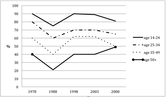
The line graph shows the percentage of different age groups of cinema visitors in a particular country from 1978 to 2008. Summarise the information by selecting and reporting the main features, and make comparisons where relevant.
Write at least 150 words.

Model Answer
The given line graph illustrates the proportion of movie goers among four age groups in a particular nation. A cursory glance at the graph is enough to make it clear that the 14 to 24 year olds were the most fond of cinema throughout the given period of three decades beginning 1978.
From 1978 to 1988, the percentage of cinema attenders fell from 90, 80, 60 and 40 to 75, 60, 40 and 20, among the 14-24, 25-34, 35-49 and the 50+ age groups respectively. The next decade saw an increase in the percentage of cinema watchers in all age groups. However, the next five years after that saw stability in the cinema attendance in all age groups. From 2003 to 2008, the popularity of cinema decreased in all age groups except for the over 50s, who started going to the cinema in more numbers.
Overall, it is clear that going to the cinema was more popular among the younger age groups and the trends were almost similar throughout, except for the 50 plus age group, after 2003, when their percentage of cinema attendance increased, whereas that of all other age groups decreased.