You should spend about 20 minutes on this task.
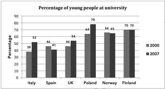
The chart below shows the percentage of young people at a university in 2000 and 2007. Summarise the information by selecting and reporting the main features and make comparisons where relevant.
Write at least 150 words.

Model Answer
The given column graph gives the percentage of young people studying in universities in six countries in 2002 and 2007. A quick glance at the graph is enough to make it clear that Italy and Poland saw the maximum surge in the percentage of Italian and Polish students over the given period of seven years.
In 2000, 70% Finnish students studied at university, which was closely followed by the Polish and Norwegian students at 64 and 66% respectively. 46% students went to university in Spain and the UK. The least (38%) Italian students enrolled in university.
In 2007, Finland saw no change in the percentage of students, whereas Norway and Spain saw a decrease of 1% and 5% respectively in the percentage of university going students. Italian and Polish students grew by 14% in each case. This was the maximum escalation seen over the years. In the UK, the proportion of students rose moderately by 8%, from 46% in 2000, to 54% in 2007.
Overall, in 2007, the percentage of Polish students at universities was the highest, whereas that of the Spanish was the least.